Test mobile layouts with Responsive Buddy
Responsive Buddy is a Chrome extension developed by Vladstudio that allows web developers to easily test their designs on different screen sizes. Unlike other extensions that can be bloated or inconvenient, Responsive Buddy offers a simple and efficient solution.
With Responsive Buddy, you get access to three phone and three tablet sizes, ranging from small to large. This eliminates the need to manually configure a list of favorite devices, saving you time and effort. Additionally, the extension provides a zoom out feature, allowing you to compensate for the difference in pixel density between your monitor and the target mobile device.
One-click switching between portrait and landscape orientation is another convenient feature of Responsive Buddy. This enables you to quickly evaluate how your design adapts to different screen orientations.
For websites that refuse to be opened in an iframe, Responsive Buddy offers an "iframe mode off" button. This ensures that you can still test your layouts even if the website does not support iframes.
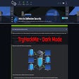
Lastly, Responsive Buddy supports dark mode, providing a more comfortable viewing experience for your eyes.
Overall, Responsive Buddy is a handy Chrome extension that simplifies the process of testing mobile layouts. Its intuitive interface and useful features make it a valuable tool for web developers.
